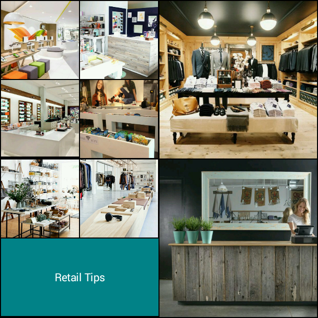
There are many different approaches when it comes to designing the interior layout of a store. There are also some guidelines and design strategies you can implement in order to generate more sales. Here are some of the basic pointers when it comes to effective retail interiors that attract more customers, gets them browsing and gets them to the checkout.
The Threshold
The threshold area or “decompression zone”, is the very first space that customers step into. It’s also the space where your customers make the transition from the outside world and first experience what you have to offer. They also make critical judgements like how cheap or expensive your store is likely to be and how well coordinated your lighting, fixtures, displays, and colors are. Since they’re in a transition mode, customers are more likely to miss any product, signage, or carts you place there.
Direction
90 percent of consumers upon entering a store will turn right unconsciously. The first wall they see is often referred to as a “power wall”, and acts as a high-impact first impression vehicle your merchandise, so be sure to give it extra special attention in terms of what you choose to display and how you display it.
Pathways
Ensure that your customer continues walking throughout your store to gain the maximum exposure to your products. , A well thought-out path can also be a great way to control traffic flow within your store. Most stores use a circular path and create a different floor finish on the paths. Remember to have an eye catching display at the end of a pathway or aisle.
Speed Bumps
You want to avoid customers from promptly rushing through your store. One way to combat this is through creating “speed bumps”. This can be anything that gives customers a visual break such as signage, and special or seasonal displays. This is also a great opportunity to make use of merchandise outposts, these can be floor standing units placed near the wall display of the complimentary products. This encourages impulse purchasing and keeps your customer in store. It is of vital importance that your high demand products, on the wall displays for example, are displayed at eye level and lesser products lower.
Comfort
Ensure that your aisle, floor, and wall displays allow customers to have more than adequate personal space when browsing your products. Incorporate a small waiting area, if the size allows for it, this encourages customers to spend more time in your store when they are accompanied by children or someone not interested in shopping.
Check Them Out
Your checkout should be located at a natural stopping point in the shopping path. If customers naturally turn right when they enter, and you’ve managed to have them circle around, you’ll realize that the left-hand side at the front is probably the ideal location for your checkout counter. However, this decision also depends on the size and layout of the store itself. Take advantage of the wall behind your counter to create an engaging feature. The counter is also a great spot to encourage impulse shopping, so take advantage of it.
From telling your brand’s story and creating immersive experiences, to putting together head-turning window displays and signage essentials, when it comes to retail, the devil really is in the details.